
Top 10 Forex Chart Patterns
Introduction
When trading forex, it's important to take advantage of every tool at your disposal. You should be using calendars, journals, fancy indicators, etc… and forex chart patterns. Some of the world's top traders rely on pattern recognition along with decades of experience honing their instincts.
So in this article I'm going to share the top 10 forex chart patterns that professional traders look for to help them maximize their returns. But first, some background on forex…
Forex market
Even if you are a beginner trader you probably know forex is the biggest financial market in the world with a total daily transaction of $6.8 trillion. If the forex market is a jungle, then chart patterns are the lanterns and paths that enable traders to make sense of the dense brush and get to their destination — large gains.
Chart patterns are great tools used by technical traders for performing technical analysis because they help traders to predict future price movements.
Chart patterns allow traders to ride the market wave, and when well understood and interpreted, they enable traders to pick out lucrative trading opportunities with minimal risk exposure.
What are forex chart patterns?
Forex chart patterns are the structures formed on the trading chart that helps the trader to determine the future price movement. Chart patterns are formed by the sentiments of millions of people making the market move by becoming buyers and sellers.
Later these patterns are given some set of rules and defined boundaries so that everyone can use them. There are three main types of charts — Line, Bar, and Candlestick.
And fundamentally, all chart patterns are classified into two segments — Continuation and Reversal.
Types of Charts
When you use forex trading tools, you’ll come across various types of charts. The three types most commonly used by forex traders are line, bar, and candlestick charts.
Line Charts
A line chart is the simplest form of a chart. They are an excellent choice for beginner traders while they continue to learn about other chart types. Unfortunately, they aren’t as efficient as other types of charts when it comes to giving information about a currency pair’s price movements.
A line chart only traces the price from one point to the next. It can show traders the trend of the price and a general sense of how the price is moving, for a particular time-frame.
Bar Charts
The bar chart goes a step further than the line charts and gives some useful information to the traders. In addition to closing prices, they also show high and low indications for the opening prices. For all vertical lines on a bar graph, the lower end of the line shows the currency pair’s lowest traded price for a certain time-frame, while the top end of the line represents the highest traded price for the given time-frame.
You’ll also see two horizontal lines protrude out of the vertical lines. The line on the left represents a currency’s opening price for a certain time, while the line on the right represents the closing price for a certain time.
Candlestick Charts
Candlestick charts are used generously by traders, and for good reason. They reveal a lot more information than the previous two types. As the name suggests, the chart is composed of candlesticks. Each candlestick represents a certain time-frame, which could be a few seconds or few hours.
For a given timeframe, a candlestick reveals four values, which include the opening price, closing price, the highest price, and the lowest price. Have you heard a trader say today’s session was “bearish” or “bullish”? You can determine this using a candlestick too. If the closing price > opening price, the session was bullish, and bearish otherwise.
Classification of chart shapes
-
Continuation
Continuation chart patterns are formed on the charts during an ongoing trend and represent that the market could still move in the same direction as it was moving earlier.
The price first moves in a specific direction either up or down and then goes into a series of a ranging zone thus forming some pattern. Then the price breaks the zone and again starts moving in the same direction.
-
Reversal patterns
Reversal chart patterns are the patterns that show that the ongoing market trend is about to change. Reversal patterns give the most suitable opportunities for the best risk to reward. The pattern shows the recent trend has faded and the market could move in the opposite direction.
Now, without further adieu, there are the rankings of the top 10 forex chart patterns that professional traders use when analyzing the market…
Top 10 forex chart patterns
1. Head and shoulders
The head and shoulders pattern is a price formation consisting of three peaks. The middle peak is the highest, and it has two smaller peaks on either side. The formation of a head and shoulders pattern is a sign of bullish to bearish reversal.
If the market has been on an uptrend and you observe the head and shoulders pattern, it is a good indication that the price will reverse to the downside.
When the highest peak forms, the price has reached a resistance level and will move down to form the second peak (shoulder). The shoulders cannot be at the same level as the head or higher than the head.
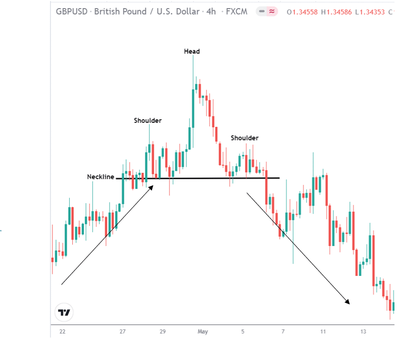
- First, we see that the price was on an extended uptrend.
- The price reached a high (shoulder) but moved down to the ‘neckline’ (support)
- Once it reached the ‘neckline’ (support) it moved further up to the ‘head’ (resistance)
- The price failed to move higher than the ‘head’ and reversed down to the ‘neckline’
- After it failed to break the ‘neckline’, it moved back up to form the second high (shoulder).
- After the second ‘shoulder’, the price moved down to the ‘neckline’ and broke the support to continue in a downtrend.
- In certain instances, the price might retest the neckline before it moves down eventually but this is not always the case.
2. Inverse Head and shoulders
The inverse head and shoulders is the same price pattern as the head and shoulders; however, it is a sign of bearish to a bullish trend reversal.
In this case, the formation is upside down. The inverse head and shoulder will form after a downtrend.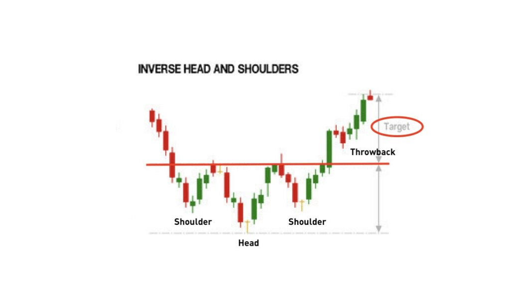
- After a downtrend, the price forms a ‘shoulder’ but reverses back up to the ‘neckline’ (resistance).
- It does not break the ‘neckline and moves back down to form a lower low, which is the ‘head’.
- The price then moves back to the ‘neckline’ and reverse back down to form the second ‘shoulder’. This ‘shoulder’ is at the same level as the first ‘shoulder’.
- After the second shoulder is formed, the price moves back up to the ‘neckline’ and breaks it by moving further up.
- Sometimes it can reverse back to the ‘neckline’ for a retest before continuing upwards.
3. Double top
A double top is formed after the price has moved upwards and it is a sign of trend reversal.
As the name suggests, it consists of two highs or tops that the price creates. When confirming a double top, it is critical to identify the support level first. A good double top pattern will have a strong downward trend following it.
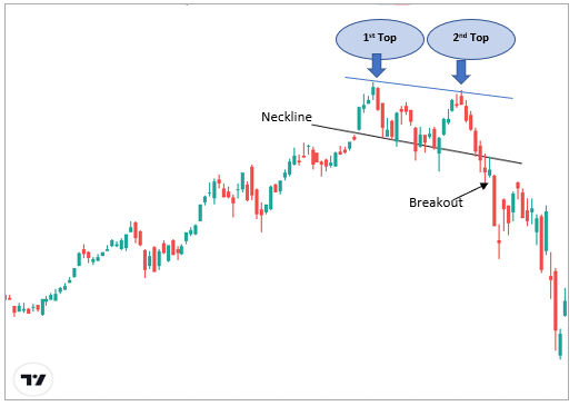
- Price is moving upwards to the first top or high
- The price fails to break this high, which is confirmed by the large wicks of the candlesticks.
- The price then reverses down to the support level.
- It fails to break the support and moves back to form another high at the same level as the first.
- After the second top is formed, the price moves down the support break this level and continues downwards.
- It is common for the price to retest the support again before continuing downwards.
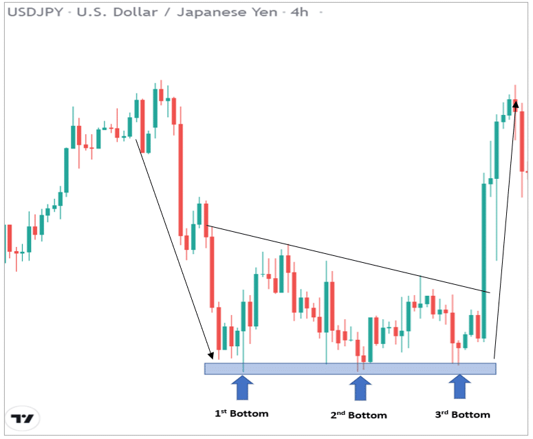
4. Double bottom
The double bottom is the inverse of the double top. The formation of this pattern is a sign that the price might reverse from a downtrend to an uptrend.
The double bottom pattern looks like a ‘W’ shape on the chart.
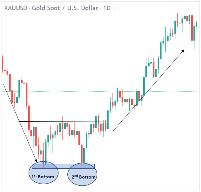
- Price is moving downwards and then reaches a support level, rebounds back up to a resistance level.
- It reverses down again to the same support zone to form the second bottom. It then moves back up the resistance.
- The move from the support zone upwards breaks the resistance and the price continues in a strong upward direction.
- Price can retest the level again before continuing up.
You will notice a lot of double bottom patterns forming due to the price action. However, not all double bottoms are a sign of trend reversal. The most effective double bottoms form in a zone that is a major resistance, where price fails to move further down.
Furthermore, double bottom formations at higher time frames like 4-hour or daily charts are more effective than lower time frames since they indicate a long-term trend change.
To find more analysis like this of market charts and trends, try out our free Telegram group for free analysis from top traders.
5. Cup and handle
A cup and handle is a price action pattern that resembles a ‘U’ shape. The formation of the cup and handle indicates an upward trend.
When identifying the cup and handle, you need to consider the following points:
- The more the bottom of the cup resembles a ‘U’ shape, the stronger the signal. A cup in the shape of a sharp ‘V’ bottom is not a good signal.
- The depth of the cup should not be too far down. The handle forms in the top half of the cup pattern and is not deep down close to the bottom.
- The volume at the lower part of the bottom should be less, meaning as price declines, the volume should decline also. As the price moves up, the volume should increase.
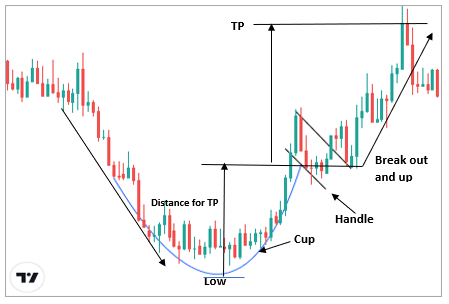
The distance between the bottom of the cup and the breakout level is a good indication of where to take profit.
Therefore, if the distance is 50 pips between the bottom of the cup and the breakout level, the take profit target can be placed 50 pips above the handle.
Furthermore, stop loss can be placed below the bottom of the cup or below the handle, depending on your risk to reward ratio.
6. Triple bottom
The triple bottom is similar to the double bottom in that it is a sign of reversal from bearish to bullish.
The main difference is that the triple bottom forms a third bottom before the price moves up and breaks the resistance.
The pattern is visually represented by three lows forming the support where price failed to break further down.
The key points to note for a triple bottom is:
- The three lows should be roughly at the same price and distance from each other.
- The formation is after an existing downtrend.
- Bearish volume should be decreasing to show that the sellers are losing strength, and bullish volume should be increasing.
Take profit targets are normally the distance between the lows and the breakout point. And stop loss can be placed below the lows or the breakout point.
7. Triple top
The triple top is the opposite of the triple bottom. This pattern usually occurs when the price has been in a long uptrend. The formation of the triple top is a sign that the price will reverse downwards.
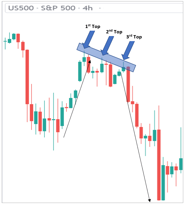
- The price was in a long uptrend and reached a resistance level, making the first top.
- It failed to break that level and bounced back to support, after which it returned back to the resistance zone forming the second top.
- It then reversed back down to the support for the second time and could not break that level.
- It then moved back up to form the third top after which it moved downwards with strong momentum.
To enter, traders should wait for the price to break the support level. The take profit target is determined by the distance between the breakout point and the resistance. Stop loss can be placed above the resistance level or depending on your risk to reward ratio.
8. Rising Wedge
A wedge pattern forms when two trend lines converge on a price chart. Wedge patterns indicate reversals in trend. They can appear as rising or falling wedges. Rising wedges indicate bearish reversal and falling wedges are a sign of bullish reversal.
The most identifiable traits of the wedge pattern are:
- The converging of two trend lines
- Volume decreases as the price movement continues through the pattern.
- Breakout from either of the trendlines.
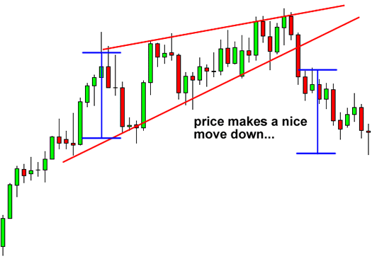
A rising wedge pattern forms when the price has been in an uptrend, but it can also occur during a downtrend.
The converging trend lines drawn above and below the price converge to aid in anticipating a breakout reversal. The price can be outside of either trendline; however, wedge patterns usually break in the opposing direction from the trend lines.
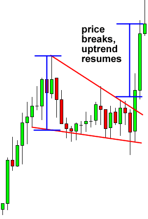
9. Falling wedge
A falling wedge can occur when the price has been in an uptrend trend for a while. It is, therefore, a continuation pattern.
The trend lines converge when the price starts losing momentum. This is usually a sign that buyers are stronger. The price might breakout above the upper trend line before the trend lines converge.
Once the price breaks out from the top trendline, it is a sign that the uptrend is continuing.
10. Diamond pattern
The diamond pattern is a little more challenging to find than the other patterns. The pattern forms at the top or the bottom of the chart. You can find a bullish or bearish diamond pattern.
Furthermore, the diamond pattern is classified as a trend reversal pattern. The price is in a range format and waiting for a breakout is the key to obtaining a good entry.
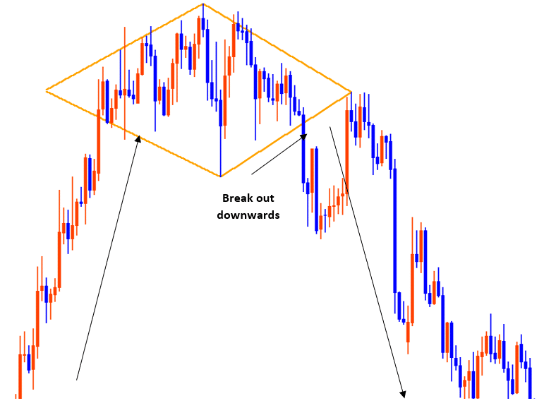
The above example shows a bearish diamond or diamond top. For a sell entry, the breakout should occur at the bottom of the right side trendline. The breakout candlestick should have strong momentum downwards.
Final thoughts on forex chart patterns
There are a number of pros and cons to forex chart patterns, and I've outlined them for you here:
Pros and Cons
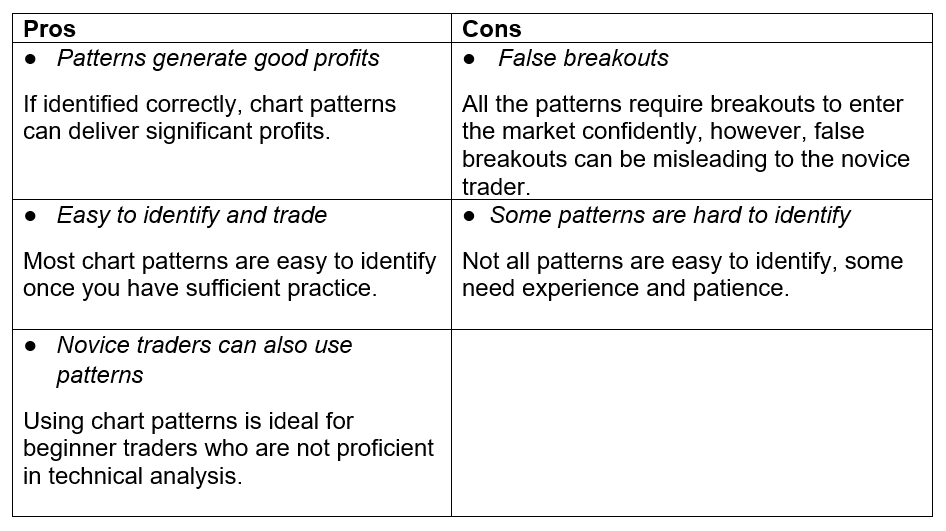
There are a lot of chart patterns available in the trading space but not all of them work effectively. Chart patterns are a part of price action trading. It does not necessarily require an indicator if you are an advanced trader. The main task here is to find if the pattern has been formed at the right place.
You can certainly study the different kinds of chart patterns and analyze the markets yourself, but why not benefit from the wealth of knowledge professional traders have gained through years of trading? To learn more, check out join our Telegram group, where you can get free tips and trading signals from our team of professional traders.


